Thursday, December 17, 2015

Extra Credit

http://petapixel.com/2012/12/04/photograph-of-doomed-man-on-subway-tracks-sparks-outrage/
1. Explain what happened to the man that was killed by the subway and how the photographer was able to take the photo. 

58-year-old Queens resident Ki Suk Han was pushed onto the tracks at 12:30pm by a panhandler who had been harassing passersby. Han had approached the man in an attempt to calm him down. The man pushed Han onto the train tracks. R. Umar Abbasi, a photographer for the New York Post, was present and he tried using his camera flash to warn the train’s operator.
2. Why did the photographer say he took the photo?
He took the photo because he tried to warn the train driver with the flash of his camera.
3. Do you think the photographer should have taken the photo?
I think the photographer should have tried to help the man before he took the image.

4. Do you think the photographer did the best thing he could have done in this situation? Why or why not? 

I dont think that was the best thing the man could've done in this situation because he couldve tried to pull the man off the tracks before the train came. 

5. Do you agree or disagree with the decision to run the photo on the front page of the New York Post? Explain why or why not. I dont agree with the decision to run the photo on the front page of the new york post because it was a gruesome image of a mans last moments. 


6. What is more important to a photojournalist, capturing images of life as it happens or stopping bad things from happening? Why or why not?

For a photojournalist capturing the images of life as it happens is more important than stopping bad things from happening because photojournalists are supposed to document the events in history as it happens. 

7. Do you think it is ever ethically acceptable for a photographer to involve himself/herself in a situation that he or she photographs? Explain why or why not.

I dont think that its ethically acceptable because then the photographer is attached to the situation and having emotions towards the awful things may affect the images or may have bias in the images. 

8. Should photojournalists always avoid influencing events as they happen? Explain your answer. 

I dont think photo journalists should always avoid influencing events as they happen because if the photojournalist has an opportunity to stop something terrible from happening or save someones life, that is more important that the image. 

9. After reading the responses from the professional photographers, what stands out as the most appropriate response for a photographer to this situation.

The most appropriate response for a photographer in this situation is to try to save the mans life. 


Wednesday, December 2, 2015

Fashion Photography

Video 1: Changes to the models face
The models lips were enlarged, her neck was stretched, her eyes were lowered and enlarged, her hair was moved down, her ears were shifted, and her collarbone was moved inward.
Video 2: Changes made to the models body
The models shoulder was raised, her skin was lightened, part of her stomach was erased, her legs were stretched out, her feet were made smaller, her arms were stretched out, her neck was raised, and part of her neck was erased.
Video 3: List the changes that were made to the model in the computer
Legs were shrunk, Arms were shrunk, parts of her body were erased, her torso was shrunk, her back was shrunk, her hands were shrunk, parts of her legs were erased, her entire body was shrunk, parts of her body was raised, her hair was raised up, her hair became longer,  her stomach was erased, ad her bodes color levels were changed. 

4. Is it ethically acceptable to change a person's appearance like these in a photo? Why or why not?
Its not ethically acceptable to change a persons appearance like in these photos because it is very demeaning and makes women feel bad about their bodies. 
5. Are there circumstances in which it would be more ethically wrong to do this type of manipulation? I don't think there are circumstanced in which it would be more ethically wrong t do this type of manipulation. 
6. What types of changes are OK, and what aren't?
Changes that are okay would be minor changes made to a persons face, the changes that aren't okay wold be changing a persons body like in the videos. 
7. Explain what you think the differences are between fashion photography and photojournalism.
Photojournalism tells a story and shares information while fashion photography doesn't have any real purpose other than to show people opinions on fashion. 
8. What relationship does each type of photography have to reality, and how does this affect the ethical practice of each? Photojournalism records what is going on in the world and fashion shows what trends are good and bad.       
9. Why do you think I am showing you these three videos?  I think you showed us these 3 videos because the information is useful for our magazine project.
10. Why are none of these videos about guys??? None of these video are about guys because people want to look at pictures of girls because they are more "mesmerizing". 


Magazines Part II

1) Early Magazine Covers
Many of the early magazine covers dedicated the opening page to a title and table of contents. Magazine covers were modeled after book. They would only show a title and publication data. The magazine didn't advertise what you would find in the magazine. In the early magazine covers it was common to you a symbolic cover which wasa generic illustration in a symbolic manner to evoke the spirit of the publication, without revealing any of this issue’s specific contents. The majority of the early magazines didn't have a cover. 
2) The poster Cover
The poster cover dominated the magazine field because it produced so many memorable covers on so many issues of so many magazines that it is sometimes looked upon as the standard against which all other kinds of covers must be measured.  Professional illustrators emerged in the late 1800s and they dominated graphic design even though there were some truly great photographs out there.  Poster covers sometimes still appear on magazines today. 
3) Pictures Married to Type
These magazine covers stunning covers left a lasting imprint on the aesthetic sensibilities of an era. Some of these covers consisted of a large title with the model’s face overlapping it, a model in a (nearly) full body pose, a model in an unusual and expressive posture, and cover lines on all sides of her, carefully positioned in relation to the model and the background. Cover lines became very important in pictures married to type. 
4) In the forest of the Woods
This type of cover is a weird pathway with many creative byways. There has been a general movement of magazine covers away from the artistic poster cover and toward covers that have an amazingly large number of vivid lines. These magazines are very culture based. Magazine covers today reflect our language, some of our thoughts, global media, advertising, and the colonization of our thinking by culture. 

My favorite cover

"Just before her intimate photos were hacked--and splashed across the Web--Jennifer Lawrence posed topless for Patrick Demarchelier for the cover of Vanity Fair's November issue. As part of the accompanying cover story, she decided to break her silence about one of the biggest scandals in Hollywood this year. The Guardian called her salvo "the end of the 'shamed starlet.'" So strong was the outpouring of social-media support for Lawrence's stance that The New York Times reported on the fact "fans took to Twitter to applaud her." Demarchelier's striking photos of the Hunger Games actress also helped spark a thoughtful debate about a woman's right to reveal her body. Lawrence (and the V.F. cover) made her message loud and clear: "It's my body, and it should be my choice." 

This is a really great image of Jennifer lawrence because the photo is very clear. The colors are very dynamic and the colors really pop. This image communicates a woman's right to do whatever she wants with her body. The lighting is at the perfect brightness. Simplicity is a composition rule that is presented very well in this image. Even though the photographer failed to avoid mergers, the image still looks good considering the photographer merged the title of the magazine with Jennifer laurences head. This photograph is very balanced, clear and dynamic. The photographer did a reply great job. 

Best covers


  1.   The Advocate, December 2014/January 2015, Person of the Year : Formal 
  2.   Wired, September 2014, Edward Snowden: formal 
  3.  ESPN The Magazine, October 13, 2014, Derek Jeter: environmental
  4.  The New Yorker, September 8, 2014, Derek Jeter Bows Out: environmental 
  5.  OUT, August 2014, Michael Sam: INFORMAL
  6.  Harper's Bazaar, March 2014, Lady Gaga: Environmental 
  7.   ESPN The Magazine, July 21, 2014, Venus Williams: Environmental 
  8.  New York, February 17–24, Spring Fashion: environmental 
  9. The Atlantic, November 2014, Why Kids Sext: environmental  
  10.  Bloomberg Businessweek, April 7-13, 2014, The Man Who Saved Marvel: environmental 
  11.  FamilyFun, August 2014, Road Trip: environmental 
  12.  The New York Times Magazine, September 14, 2014, The Culture Issue : Formal 
  13. Harper's Bazaar, September 2014, Emma Ferrer Formal 
  14.  Vanity Fair, November 2014, Jennifer Lawrence: Formal 
  15. Variety, October 14, 2014, Bill Murray: Informal 
  16.  New York, June 9-15, 2014, Health: Informal 
  17. Men's Health, November 2014, The Ultimate Men's Health Guy : Formal 
  18. Bloomberg Businessweek, April 21-27, 2014, Freeze Your Eggs, Free Your Career Formal

Magazine Tips

5 things you should think about when making a magazine cover

1)Familiar recognition from issue to issue (that’s the brand)
2) Arousing curiosity (that’s to pull the casual glancer in)
3)is it Worth the investment of money and time (that’s the “What’s in it for me?”)
4)Efficient, fast, easy to scan
5) Emotionally irresistible (that’s the image’s appeal)

Friday, November 13, 2015

Portrait/ Self Portrait Preview


Love and Loss Warmup
1. What emotions did you feel as you worked your way through these images? I felt sad as i worked my way through these images. 

2. The photographer said this: "These photographs do not define us, but they are us." What do you think about this comment now that you have looked at the photos? These photos capture the chronological order of hardships the woman went through but they don't define how she felt during them.
3. Do you think you could shoot photos like this if you were in this situation?
I don't think i could shoot photos like this if i were in this situation because it would make me to sad.
4. If you could write Angelo a letter, what would you say to him? If i could write a letter to anglo i would apologize for his loss and give him positive feedback on his extraordinary photos. 


Self Portrait and Portraits Part I
2-3 best tips 
1) Alter Your Perspective
2) Introduce Movement
3) Experimenting with your background 
 Environmental Portraits
I choose this image because the angle was really cool. 

I liked this image because the lady is on a tire and i find that very interesting. 


Photography self portrait
I choose this photo because i thought this persons face was very funny. 

I choose this photo because i thought it was interesting that the mans face blends into the background. 

Casual portrait
I choose this picture because it is interesting how the background is blurred while the main subject 
I choose this image because i thought the angle the camera was at made the image look very interesting 

I will take a picture of one of my neighbors. I will take the portrait of them outdoors in our neighborhood.  In order to make the shoot successful i will Alter my Perspective, Introduce Movement, and  experiment with my background.


Friday, November 6, 2015

American Soldier

A. I think the most powerful image in the slideshow is the image of Ian being reunited with his girlfriend after he survived the war.
B.
Set 1 - at home  - Image #1 to Image 4 
Set 2 - basic training - Image #4 to Image 20
Set 3 - in Iraq - Image 20 to Image 27
In Image #28 he is back at home in Denver

C.
The set of images that were the most powerful was set 2. Set 2 had the most powerful pictures because the pictures showed Ians transition into a soldier. 
D. The images worked together to tells the story by showing the pictures in the order that Ian lived them. 
E. The verbs are usually written in past tense.
F.
The captions enhance the photographs by giving the images a very dramatic backstory. 
G.
After Ian graduated high school, he decided to join the army. he said goodbye to his friend and family and shipped out only 2 weeks after his high school graduation. He went to boot camp, encountering Intense physical training and high-decibel harassment. He soon realized that he had entered ''a new and different culture.'' After his 14 weeks, Ian could finally put his training to use in Iraq.  After he fights for his country, Ian is welcomed home by his friends and family. 

Monday, November 2, 2015

Rules of Photography Part 2

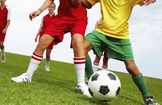
Theme- Soccer 


1. Rule of thirds:

2. Balancing Elements


3. Leading Lines


4. Symmetry and Patterns (repetition) 


5. Viewpoint


6. Background


7. Create depth


8. Framing


9. Cropping


10. Mergers and avoiding them

Thursday, October 29, 2015

Funny Captions

 Billy and Jan are protesting against protesters in New York City with the help of their friend Betty White. Billy and Jan were tired of people protesting every little thing that was wrong with the world, so they decided to have a protest of their own.

Herbert and Shirley are  snooping on their neighbors with Shirley's binoculars and they are hiding behind Herbert's newspaper.  They suspected that their neighbors are stealing their newspaper... they forgot that herbert has it.
Pam hates everyone because she is very nit social. She doesn't like to go to the grocery store with her sitter, Janet, who is taking this image. Janet bought the shirt to make fun of Pam but Pam wore it anyway.

Abandoned Theme Parks


1) I would like to go to BONUS Chippewa Lake Park, Medina County, Ohio. I think it would be cool to visit because it had a lot of wildlife growing around the rides. I also think that the rides look very interesting with the vines encircling parts of the wood. 
2) 
3) Five usual places that I think would interest photographers are; castle hill, Abandoned mansions, haunted houses, islands, and coral reefs. 
4) Noel Kerns- 

5) Think it could be fun to document an abandoned mansion. I think this would be interesting because you would be able to take pictures without the distraction of pedestrians. There could also be a lot of interesting pants or animal that have inhabited the inside of the abandoned mansion which could be a super cool thing to shoot. 
6) In order to take pots at an abandoned mansion i may encounter plane expenses if there was a mansion out of the state that i want to take pictures of. If I wanted to take pictures of the mansion above i would only have to drive there because it is located in Texas. I would consider that i may trespass if i want to take an image on private property. I would need to bring a camera with me. 


Africa and Abandoned Theme Parks


1) I was amazed at how close the photographers got to the animals in order to take these photograph.  I saw many different kinds of animals that are hospitable in Africa. I was surprised when i found out the photographer spent months in Africa in order to get these images.
2)
3) This is a herd of elephants traveling to a new location somewhere in Africa.  This is my favorite image because I thought it was interesting that there are so many elephants in the herd. I was also very impressed that the photographer got so close to the elephants without scaring them.
4)  Simplicity and Lines are both present in this image. Lines is shown by the elephants walking behind each other in the herd. Simplicity is shown because the background is very plain so your ye is drawn to the elephants. 
5) He uses a 2003 model Nikon Scan 9000
6) He takes these pictures because they are the fastest way to make an impact on the world. 
7) He hoped to make an impact on the world and to showThat animals are sentient creatures equally worthy of life as us.
8) Nick BRant," ... we need to stop destroying the natural world. Man should NOT have Dominion over Nature (the most damaging notion ever set down by mankind)."

Monday, October 19, 2015

Mural + Great Black and White Photographers PART 3

Mural Project

1. What theme, that we could take here at school, could we do a series of these panels to place around the school?
We could do an academic theme.

2. Should we use phones only, or should we open it up to our regular cameras for those people that don't have camera phones? I think w should open it up to all cameras.

3. Where would you want to put the mural on campus?

I want to put the mural in the front of the school so everyone can see it.

Great Black and White Photographers Part 3
1) The clouds first caught my eye while i was looking at my photographers photo because the clouds ear your eye down to the mountains. I chose this image because i thought that Ansel Adams image was at a very interesting angle.


Image result for ansel adams black and white pictures
2) 
I see gray clouds nearing the mountain tops and pointy trees. i see the sun emerging from behind the wisps of the clouds. i see the river curving around the horizon.
I smell the overwhelming scent of pinecones and tree sap. I smell the droplets of the river surfacing to the ground. I smell the river water rushing around the river bend.
I hear the wind blowing through the leaves in the trees. I hear the birds chirping with glee. I hear the rushing river water racing towards the mountains.
I taste the metallic river water. I taste the grass and dirt below the treetops. i taste the rusty taste of the mountains.
I feel calm viewing the surreal sight of nature. I feel the breeze brush against my clothing. I feel the sun warming my back as i gaze upon the mountains. 

Image result for ansel adams black and white pictures
I see water racing down the side of the cliff. I see animals in their tee homes. I see fish spazzing in the water.
I smell mist radiating off of the waterfall. I smell bark and freshly grown leaves emerging from the trees. I smell the fish swimming wight the current of the water fall.
I hear the crash of the waterfall colliding wight the ricks below. i hear fish flapping in the current. i hear birds chirping t the animals near them.
I taste the mist radiating of of the rocks below. i taste the fresh air coming from the trees. I taste the bark of the trees.
I feel calm looking at this spectacular view of nature in its natural habitat. I feel the strong breeze coming off of the waterfall. I feel the sun warm my back and dry the mist. 

3) I would like to create a blog to share my ideas as a photographer. 


Friday, October 9, 2015

Academic Shoot Reflection and critique


1) The challenges I faced while shooting were finding academic rooms and getting pictures of the students without them making goofy faces.
2) I found myself thinking about the focus the most because i feel that focus and clarity are the most important aspects of a photograph. In order to do this correctly i would slightly press down on the shoot button until the photo was as clear as i wanted it to be.
3) If I could do this assignment over again i would take photos of the students from different angles.
4) I would still pay very close attention to the focus and claret of my images.
5) When i go out o shoot my next prompt i think that simplicity will be the easiest to achieve.
6) I think that lines would be the hardest to capture.
7) I am still not very clear on what balance s. In order to figure it out I can refer back to the composition website we visited a while ago.

http://ivyphotojblog.blogspot.com/2015/10/academic-post-shoot.html

I really like how clear and focused all of Ivy's Pictures are. I also love how vibrant and dynamic they are. She could improve on adding more rules of composition to her images.

Academic Post Shoot Reflection and Peer Review


1) In this image I tried to follow rule of thirds. Rule of thirds is shown because the main subject is in the upper left corner.
2) The subject in this image is the person drawing.
3) I believe the subject is clear to see because the subject takes up a lot of space in the photo.
4) I wouldn't have done nothing differently in this image.


1) In this image I tried to follow the rule of balance. This image show balance because the four girls show a very balanced geometric shape.
2) The subjects in this image are the four girls working on there assignment.
3) I believe the subjects are very clear in this image because they are the first thing that your eye is drawn to. They also take up a lot of space in this photograph.
4) I would've gotten closer to the subjects or zoomed in so that you could see the girls clearer.

1)This image shows balance because there are many geometric shapes this person is making in this image.
2) the subject in this image is the girl sliding her papers out of her binder. 
3) I believe the subject is very clear because  the subject takes up the majority of the picture and has very vibrant colors which attracts your eye. 
4) The only thing that I would've done differently is shifting so her backpack wouldn't take up as much room.

Monday, October 5, 2015

Aperture, Shutter Speed, and ISO

F2.8
F18

1) The part of the body that we should closely relate aperture to are our eyes.
2) The smaller the aperture number, the higher the Aperture size.
3) Aperture impacts depth of field by making the background image appear clearer or blurrier.

High Shutter Speed

 Low Shutter Speed


1) If i was assigned to shoot bulldogs and hotdogs during the day,  I think i would have to shoot  f) the basketball booth where students are shooting basketballs at a hoop and d) students dancing in the center of the courtyard because you would have to capture their motion. If i was assigned to shoot bulldogs and hotdogs at night, i think i would have to shoot c) the Stars performance inside the gym and e) people streaming in from the front doors.
2) The 3 settings my camera has regarding shutter speed are Manual, Shutter Priority and Aperture priority.  Manual is when you set up Shutter and Aperture up manually. Shutter Priority is when you set the shutter and the aperture is set automatically. Aperture priority is when you manually set the aperture and the camera automatically sets the shutter.

ISO 200

 ISO 3200

1) The advantages of shooting with a high ISO at a sporting event is the image will appear clearer and can capture photos in under a second.
2) You should almost always use low ISO because you will retain the most detail and will have the highest image quality.
3)  You should use a high ISO when there is not enough light for a camera to quickly capture an image.

The aperture settings available on this camera are 2.8 , 4, 5.6, 8, 11, 16, and 22.
The shutter speed settings are  1 second, 1/60 of a second and 1/4000 of a second.
The ISO settings on this camera are 100, 200, 400, 800, 1600, 3200, 6400, 12800 and 25600.